[ Jump over to our Web Development portfolio ]
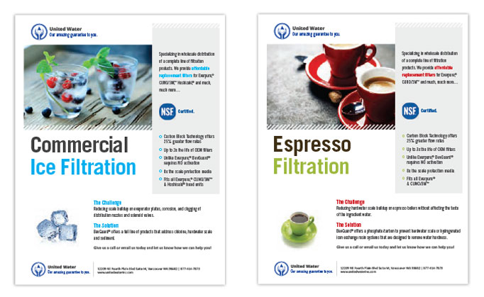
United Water info sheets
It’s tough to make water filtration look sexy, but we did our best! United Water needed information sheets that didn’t read like a page out of the parts catalog. We found photos that would make their clients almost taste that cool drink of water and helped the filtration company come alive.
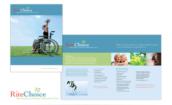
Rite Choice brochure
The owners of RiteChoice have a great service business and plenty of experience, but they had always relied on word-of-mouth to capture new clientele. They were ready to advertise, but all they had were flyers they had created themselves in Microsoft Word. Their job is taking care of a vulnerable population—they needed to make sure their marketing materials gave them credibility. They didn’t have a logo or a budget to design one at the time, so we threw together a quick typographical solution that would look nice on the brochure. We took in-house headshots of the owners, scrambled up some stock photography, and designed a professional brochure that would resonate with their audience.
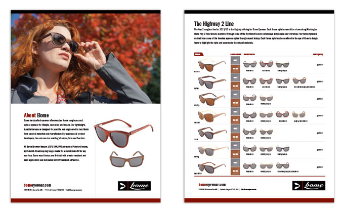
Bome info sheet
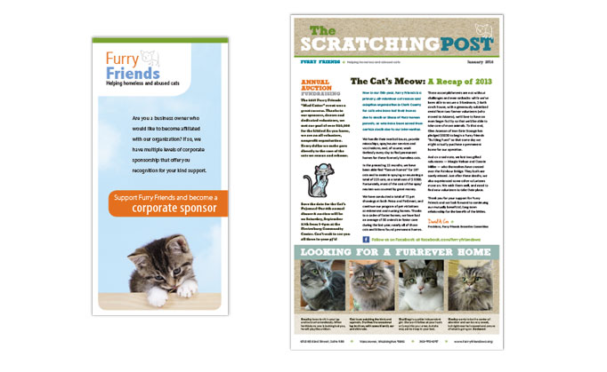
Furry Friends brochure and newsletter
We do a bit of pro-bono work now and then, when an organization or cause particulary resonates with us. We were pleased to get involved with Furry Friends about 10 years ago when another one of our clients approached us and asked us if we could help overhaul their website. We tackled this project in our spare time, and that led to hands-on volunteering with the cat rescue organization. We eventually designed business cards, brochures, and now we still design their quarterly newsletter!
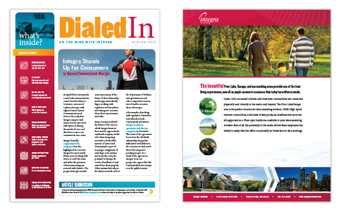
Integra newsletter and flyer
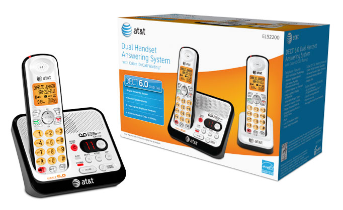
AT&T telephone packaging
We spent about 10 years producing the yearly line-up of land-line telephone packaging for AT&T and Vtech brand telephones. Our contributions included Photoshop retouching of the product images, package layout production, start-to-finish project management and designing and producing collateral for tradeshows and in-store product displays.
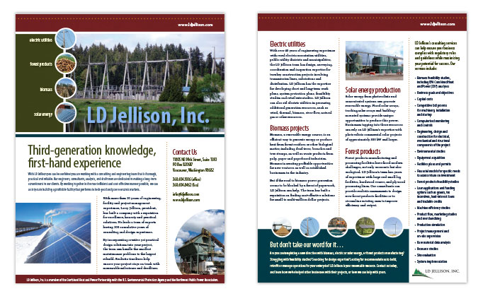
LD Jellison info sheet
LD Jellison needed a way to present a lot of engineering information in a professional yet approachable way that didn’t make their customer’s eyes glaze over. We helped them pare down the copy, find some great photos, and wrapped the whole thing up in a bright—and dare we say fun—info sheet.
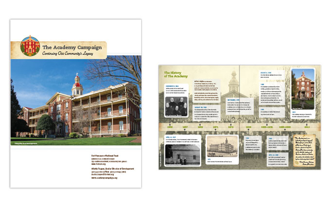
Academy Capital Campaign brochure
When the Historic Trust took steps to secure the purchase of the Academy building in downtown Vancouver, they had to raise a lot of funds to help with their mission. The Trust was already a great client—we spent a lot of time working with them to overhaul their old website. When they asked for help with a brochure and small website to promote their capital campaign, we were happly to offer it up pro-bono! They gave us complete creative freedom and the project turned into a beautiful multi-page promotional booklet.
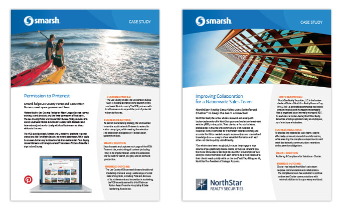
Smarsh case studies
This is an example of something we call ‘corporate outsourcing work.’ A lot of large corporations have their own in-house designers, but sometimes the workload is more than they have the resources for. That is where we step in! We can help with original creative work (as shown in this example), or we are more than happy to pick up the slack and do any repetitive production layout work that is needed.
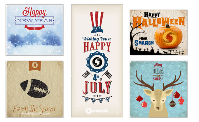
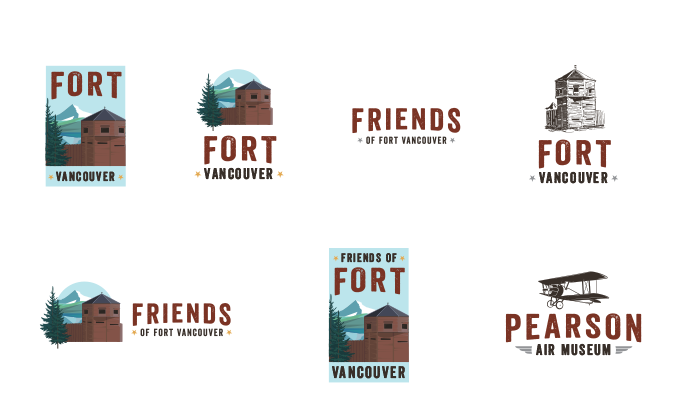
Friends of Fort Vancouver logo family
Friends of Fort Vanouver is a non-profit organziation that works to inspire, inform, and connect visitors, supporters, and the community to the Fort Vancouver National Historic Site. Whew, that’s a big mission! They hired us to completely overhaul their website to make it engaging to the community, and they needed a brand new logo to go along with it. They use their logo on event advertisements, promotional materials, t-shirts, keychains, and more. We designed a family of logos they could use for all these purposes, that reflects the history of the celebrated landmark.
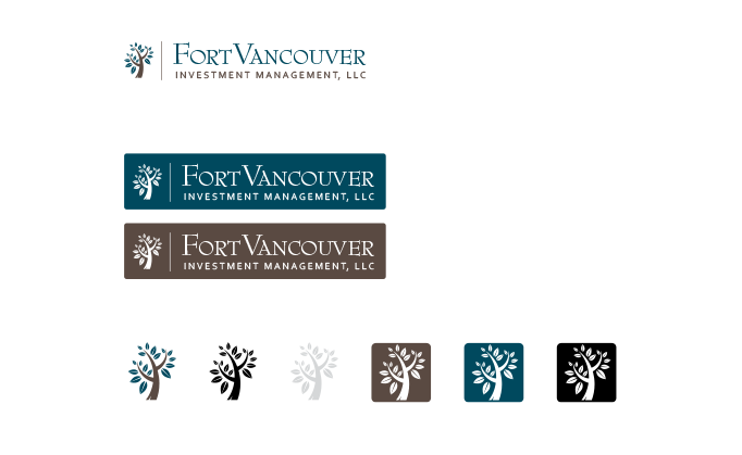
Fort Vancouver Investment Management logo family
Arcadia Investment Management is a long-time client and when the partners decided to split the company up between their Vancouver, Portland, and Idaho locations, Fort Vancouver Investment Management was born. They needed a complete new branding package—logo, business cards, stationery, presentation folders, and a website. They liked the idea of a nature theme, but decided that they didn’t want their brand tied to the Fort Vancouver site (where their office is located on Officers Row). This is the final logo family we ended up creating for them.
Fort Vancouver Investment Management logo work
Sometimes clients don’t have a concrete idea of what direction they want to take with their new logo design. In those cases, we come up with a lot of different ideas and find a direction that hits the right note with our client. Here are some examples of preliminary logo designs we created for FVIM on the way to their final logo choice.
Twisted Trek Athletics logo family
Twisted Trek Athletics provides personal training and fitness classes, but they had a dream of producing their own local trail racing events. One of their first steps was to solidify their branding. They had very specific ideas of artwork they wanted included in the logo— a twisted tree, a trail, and footprints. They also wanted something that could be adapted for different seasons or special holiday events. These ideas all converged into the Twisted Trek ‘badges,’ that could be used on marketing materials, racing t-shirts or prize swag.